I’ve wanted a mobile companion application for ddxof for a while. I’m not entirely sure that anyone else feels strongly about it, but I use the content regularly on shift and trying to load even the mobile-optimized website on my phone was cumbersome. Dropbox worked for a while but it didn’t maintain the taxonomy I’d assigned on the website and text content wasn’t included.
While I have some experience with web development, a quick peek at Objective C and native app development suggested I would be in over my head. So, I sought some funding, designed a few basic screens in Sketch, and waited to see what the development team came up with.

Sketches of different screens on the app
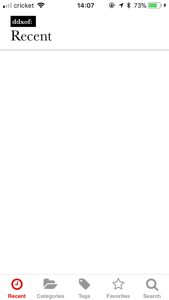
Version 1.0
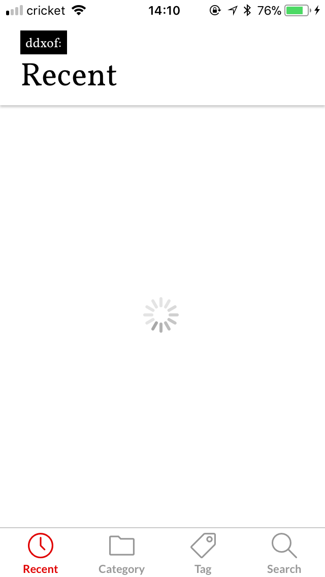
The app hung on this screen for 20 seconds on launch
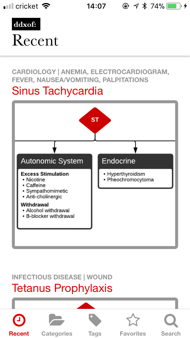
When it loaded, things looked pretty good
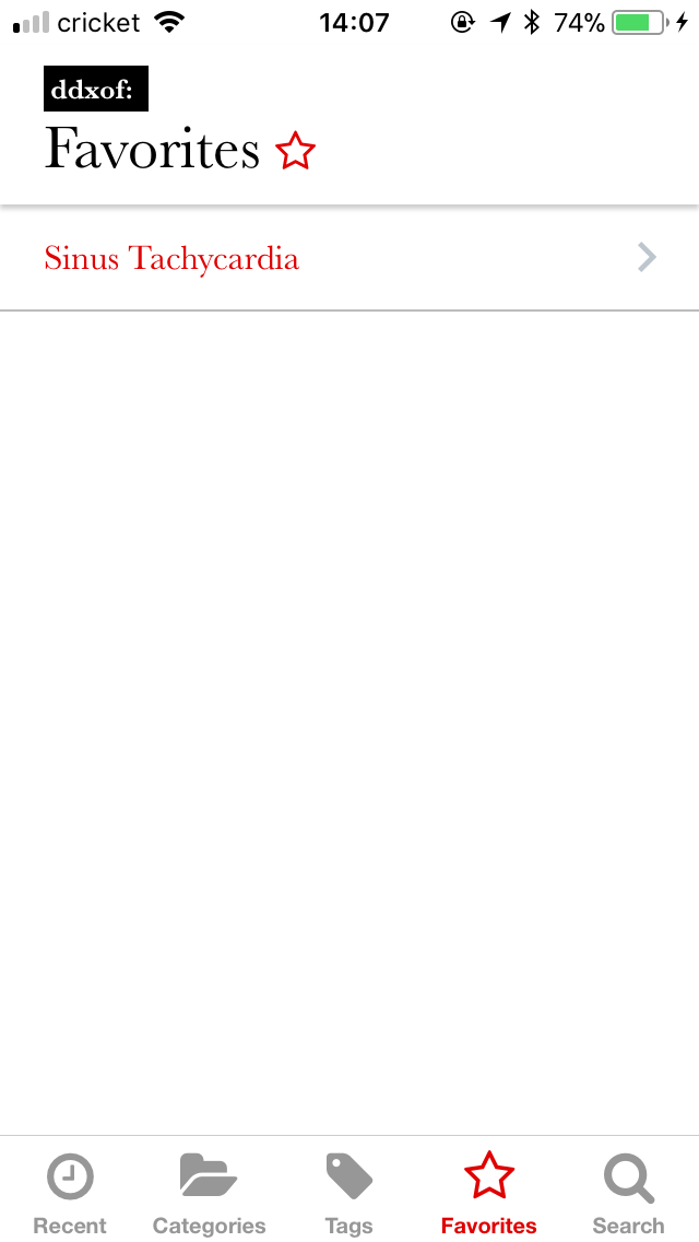
It even had working favorites
In November, I saw the final product and it was a bit of a fixer-upper. Much of the functionality was present (including adding Favorites). Unfortunately, less attention seemed to have been paid to certain usability aspects and the visual style I’d developed in the design compositions.
Most glaring was the lack of any representation of a loading state. It pained me to watch coworkers download the app and see a blank screen that ignored their interaction attempts for a solid 20 seconds on the app’s initial launch.
Luckily, I got access to the source code and found that it was built with something called React Native. As I sifted through the code, I realized that I recognized and (mostly) understood what was happening. It was basically JavaScript, I know JavaScript! The display and styling portions were also easy to grasp as they’re similar to HTML and CSS respectively.
I tried to work backwards from the code I’d received but it was just too hard to grasp. The extent of my JavaScript experience prior to this was rudimentary so after going back and forth a few times between attempting to improve upon the existing app and just starting from scratch, I decided to dive in and begin anew.
Version 2.0
A real loading indicator
I lost a few things, no multiple algorithms, no categories/tags
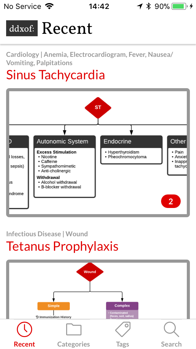
By version 2.3, we had post categories/tags and a gallery view for multiple algorithms
Exactly 1 month later, I released version 2.0 of the ddxof: mobile application. Since it was built from scratch, I had to remove some of the features that were too complex for me to develop. Removing the option to save favorites was a tough choice but I was excited to have a version of the application that at least wouldn’t make me cringe when I saw it in use.
The only reason I was even able to get that far was the truly impressive community surrounding React Native. I thought of them a bit like plugins, and using a few components really simplified the process of interacting with the website’s API and storing content for offline use.
In landscape mode, the header occupied pretty much the entire screen
Version 2.4.2 shrunk the header down
Over the next two months, I worked on iterative functional and visual improvements including better server- and client-side caching, and the ability to see all of post’s algorithms (with an image gallery “plugin”). Things settled down by version 2.4.2, it worked, was mostly bug free, and I took a break.
Version 3.0
As I used the app more, a few things kept bugging me. I really missed being able to save favorites and I was often annoyed that the app didn’t allow interaction during attempts at refreshing content (even though usable cached content was available).
Version 3.0 with a more subdued color scheme
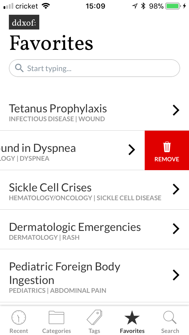
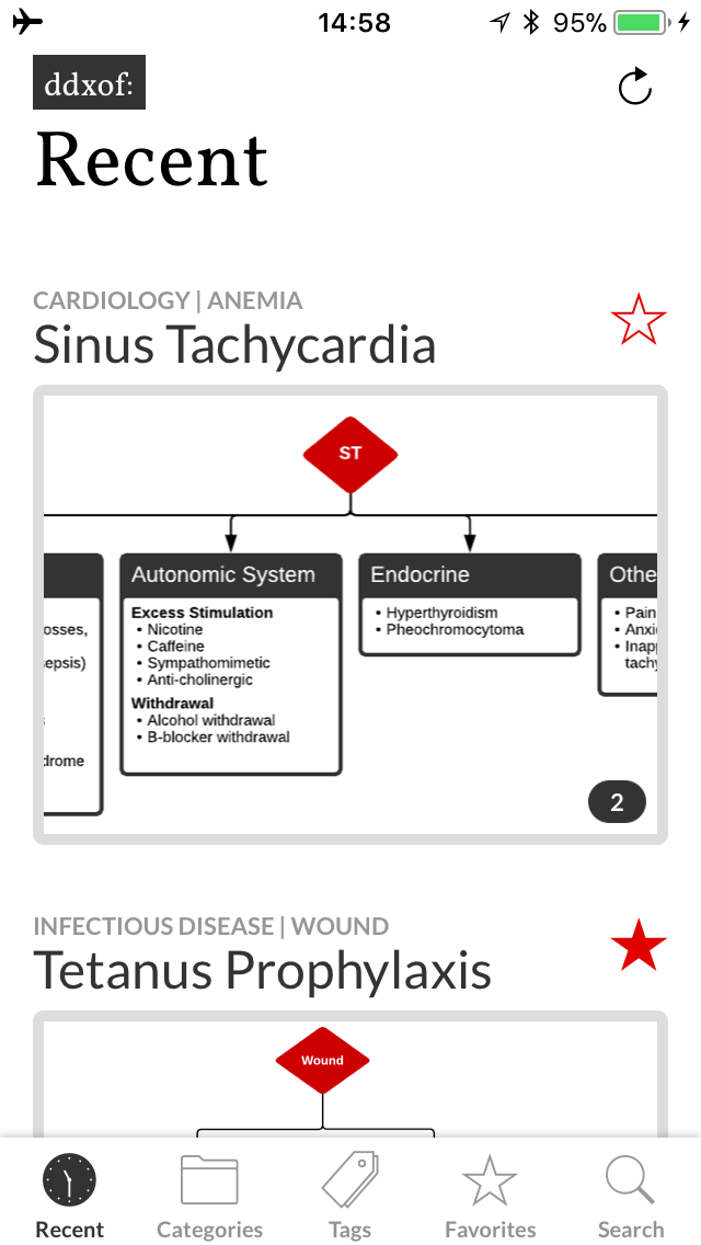
Favorites are back

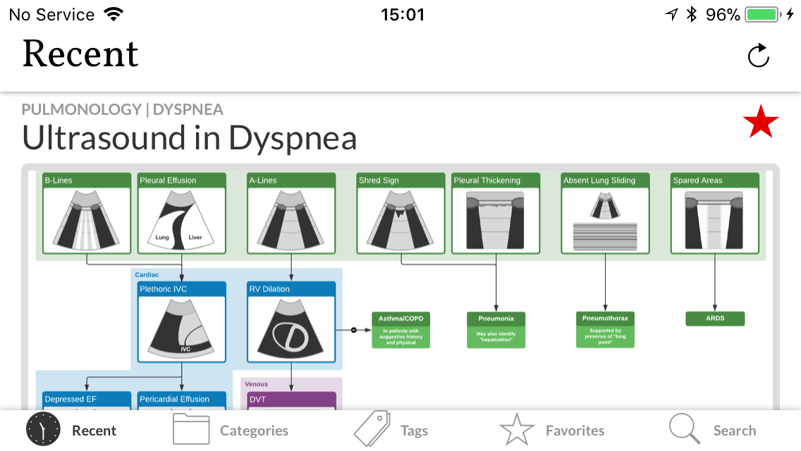
Cached content remains accessible if a network error occurs
I knew favorites was going to be a problem, I’d tried tackling it earlier when I started working on version 2.0 but had given up. The problem is that an article marked as a favorite needs to be recognized across all parts of the application. This notion of state management in React Native seemed to commonly be handled by a library called Redux. However, despite my best efforts I simply could not wrap my head around the logic. After all, I’m still not a developer and I found myself getting lost in descriptions of “actions” and “reducers”. I was thrilled when I found Mobx which accomplished everything I needed in a much more understandable fashion. My favorites list became an observable that I could access and remained alive wherever I needed it and making the information persist on the user’s device was laughably easy with another plugin.
Using Mobx also meant that I could check for content updates in the background without interrupting the user’s ability to interact with cached content. The small indicator area lets users refresh the content, notify them of a refresh attempt and even connection errors.

The uncollapsed header in landscape mode
The header animates down when scrolling
I also took the opportunity to touch up a few interface issues. The header shrinks with a hopefully-subtle animation when scrolling to provide more space for content. I was also finding the red a bit overwhelming, the muted grays are much more my style.
I’m happy to announce that version 3.0 is now available on the App Store and Google Play Store. Please try it out and let me know what you think!
